Current
7 July - 7 September 2025
Jen Siegel: ART/ON&OF/CARS

ART/ON&OF/CARS exhibition of works by Jen Siegel
The 1957 Chevy Headlight was shot in black and white film on an analog Asahi Pentax SP1000 camera. It encapsulates a lot of automotive history representative in the vintage style lens and curved housing. Finding beauty in it’s decay, I created an abstracted modern-art piece in ink, water and acrylic.
The other works were created in mixed media- the first, a still-life utilising the actual mixed car-colour of Subaru Grey enamel paint, actual pieces of window-tint, paint pen, India ink, lead pencil, marker, and possibly color pencil on paper. Glow-in-the-dark paint was also utilised in the headlamps and fog lights in giving much realism to the work, bringing it to life in that they actually work: under the cover of darkness, the lights illuminate. They work. The car’s background was done in whiteboard marker on the outside of the frame’s glass in order that it can be changed- as a car’s viewed backdrop should be ever-changing as it is being driven.
The rendering of the white car was photographed and referenced in this freehanded mixed media on asphalt felt (roofing underlay) in white paint pen, marker, twink, craypas, pencil, and India ink.
If you would like to commission a custom art work either ON or OF your car- please contact Jen at onyamind@gmail.com


Car Window Tinting and stylization, with a methodological dissertation in houndstooth.
I set out drawing the houndstooth pattern with the mind to making a stencil for a custom window tint idea that I’d had in trying to make a concept-car become a reality. Little did I know that this would send me down a path of not only methodological experimentation but also of one of deep artistic philosophy I suppose. I was surprised by the complexity in the task when I thought it seemed straightforward and hardly even an artistic endeavor at all.
I had never delved into stencilling previously. Neither had I considered anything to do with a repeating pattern, shape, something requiring the use of a ruler or that could be expressed mathematically-as being anything impressive, or particularly artistic in the traditional sense; in fact I must admit that I considered both of these to be “artistic” approaches for people who can’t really draw. I figured there couldn’t be much thinking behind something that is literally black and white and all comprised of stick-straight lines… it seemed straightforward.
So began a journey that took several years of development and a surprising amount of incidental realizations.
Before I could make my stencil I had to figure out how to render houndstooth. I started trying to draw the thing and made a checkerboard and then adding the “teeth” and “legs” afterwards. I quickly discovered that the need for uniformity required a more different approach than trying to freehand it with regard to getting everything on the same angle…
After I figured out how to do that I also had the problem of the fact that to do this particular pattern as a stencil was actually impossible because of the fact that none of the houndstooth shapes of which the pattern is comprised actually even touch one another - they are all individual shapes that are horizontally and vertically adjacent but not actually connected… So as a stencil one would wind up with a bunch of pieces that would have to be arranged individually and impossible to align by hand. I wound up having to redesign how it would all fit together.
I also wanted it to look fast on the sides of the car so I changed the proportions and put things on more of a slant, causing the measurements to change, further compounding the issue of creating apparent uniformity and alignment.
I made different versions of the shape that I wanted for various applications; I started doing a pixelated version of houndstooth that I was thinking of using as a tint strip on another car. I chose however many blocks I decided looked right visually in creating a sort of quantized look. It wasn’t until after the fact that it dawned on me that the number of pixels represented actually correlate to the number of stitches required in creating the shape: like if you were knitting it- which would be where you would have traditionally encountered it…I think it is safe to say that before it was being used as a popular print-design it was a textile-design.
It wasn’t until about 2 and 1/2 years of drawing the pattern that I even actually realised that this crazy shape is made actually just from two intersecting lines of diagonal lines!
In trying to make the window tint stencil I had to experiment with a lot of different materials as well. I had to find something that wouldn’t leave residue on the sticky side of the tint- in order to apply the stencil. It also had to be somewhat durable in order that it could be removed and reused. I tried mylar I tried paper I tried even having a stencil laser cut from sheet metal.
The guy asked me if he should cut out the black or the white part of the pattern… This is when I realised the difference between pattern and shape because in replacing one of the colours with transparency- a shape has been defined through the use of negative space therefore transmuting the interchangeability of either color’s equal contribution to the overall pattern to now having only one holding any weight, substance or definition.
This all stemmed from considering the difference between my having applied silver paint to the black window tint, in contrast to if I had instead made a decal or cutout, and whether it mattered that the guy at the engineering place cut out the black or the white of the pattern; what the implications of these differences were… because it did make a difference to what I was fabricating- it had to be one piece. (The negative space for the cutout had to be demarcated and a border had to be incorporated; necessitating the designation of black and white respectively.)
This is how over-thought my particular artistic approach to modernising the 90’s throwback style of the silver fade on the window tints got. All that- and I was just trying to make my car look cool.
The paisley embellishment I styled the other car with is to affect a “kinda loc-ed out” look in a nod to the low rider car culture … I just free-handed it straight on the windscreen with paint-pen.
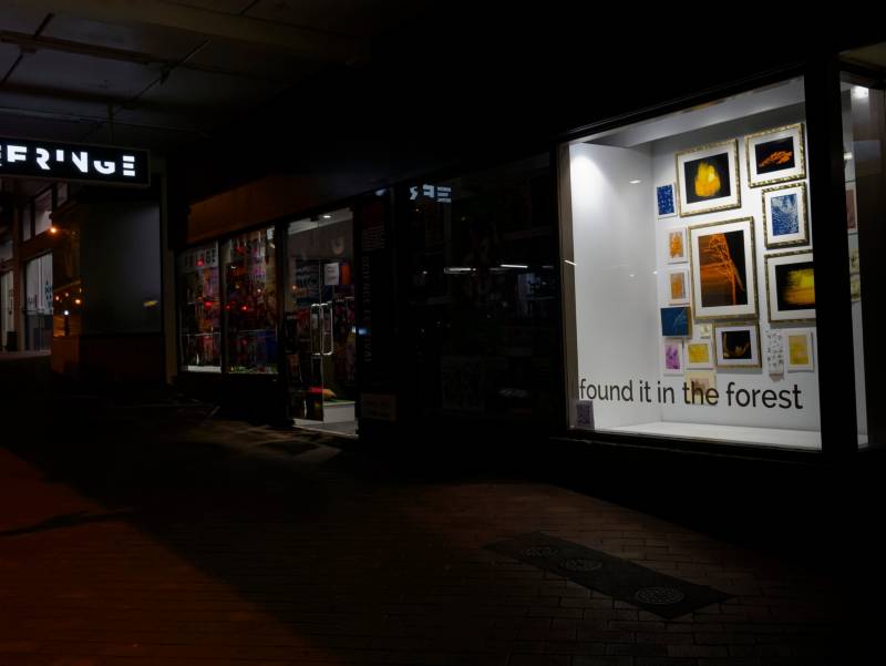
White Box
About Us
Dunedin Fringe envisions a city ignited by creativity, where all people embrace art, culture and creativity into their daily lives.
We have a mission to provide platforms for creative expression that help nurture communities. We have a special focus on supporting emerging artists, and the development of new and experimental work.
We produce the Dunedin Fringe Festival, Amped Music Project and New Zealand Young Writers Festival annually, curate the White Box Gallery, and manage the performing arts venue Te Whare o Rukutia.
Useful Links
Our Contacts
Dunedin Fringe Arts Trust
19 George Street,
Dunedin 9016,
Aotearoa New Zealand
03 477 3350